ShopDreamUp AI ArtDreamUp
Deviation Actions


Suggested Deviants


Suggested Collections


You Might Like…


Featured in Groups


Description
My groups 

 Made by me
 FULL VIEW recommended!
 This photo CANNOT be used WITHOUT my written permission!
 This picture / graphic work doesn't violate any copyright,so before deleting it be sure
that something has been violated and contact me please!
 I'd like to thank you in advance if you do fav
  this photo


All the images submitted on my profile (c) Francesca Delfino (LadyfataDudesons)
that something has been violated and contact me please!
All the images submitted on my profile (c) Francesca Delfino (LadyfataDudesons)
Image size
800x800px 114.73 KB
Make
FUJIFILM
Model
FinePix JZ300
Shutter Speed
1/44 second
Aperture
F/3.3
Focal Length
5 mm
ISO Speed
100
Date Taken
May 24, 2012, 6:26:41 AM
Sensor Size
2mm
© 2012 - 2024 FrancescaDelfino
Comments10
Join the community to add your comment. Already a deviant? Log In
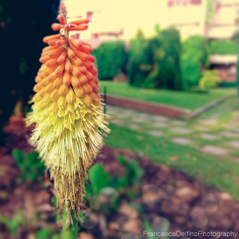
I rather like this picture, but that is not to say it doesn't have its faults.
The colors are amazing because the reds and yellows in the foreground plants are the only of its kind in the photograph, drawing the viewer's attention. The blacks at the base of the flower also show the fine detail of the flower, making it stand out against the out-of-focus background.
One thing that would make the photo pop a little more would be if the picture had a bright white in it to counter the near black at the top left. If the building at the top was white, or even just a little brighter, it would offer a more stark contrast to the flower causing it to stand out even more. If the building is actually yellow, I would instead try to fade the plant at the top left or artificially light the flower to make it much brighter to show off the near-white at the bottom.
The focus of the picture is a little off. The entire flower in the foreground isn't in focus, which can be seen around the edges of the flower and the stem. Only the parts of the flower closest to the camera are. If my attention is going to be focused on the flower, I would really like it if the entire flower was focused on, even the stem.
In the bottom left corner are circles either from water or reflections from light. Those should either be remedied at the camera level or taken out in post-production.
Great job overall, and I'd be glad to view more of your work!